

-
Project
Grecian Air Website
-
Role
Sole User Researcher - Sole UX/UI Designer
-
Where
UX Institute Diploma Case Study – completed through remote studies from Athens, Greece
-
Duration
1 year | June 2023- June 2024
Perfecting the booking process
The goal of this project was to design the booking flow for 'Grecian Air,' a fictional Greek airline start-up. The company emphasized that the online experience needed to be fast, easy, and intuitive, built on a deep understanding of their target users. The final objective was to design and create a clickable prototype for user testing, alongside a comprehensive set of wireframes to be handed off to both UI designers and developers.
To deepen my learning, I extended the project from many iterations to final UI completion and delivered the final UI screens and prototype for the mobile version as well.
Results
First things first…
On June 2023, I enrolled for the UX Diploma from UX Institute. For the completion of the
course I had to complete a real case scenario study based on a fictitious Greek Start up
airlines problem statement.
Meeting and communicating through a slack channel with the team - mostly mentors and student success staff who were handling the data and information was a key point as I managed to set clearer the expectations and the challenges and have a shared vision for the project.
Kick off
Before starting the project, I aimed to
Define the goals and determine what success should look like upon completing the prototype.
I also sought to identify how to measure that success—a challenge, as there was no clear mission or specific objectives for perfecting the booking process at that stage.
So I decided to proceed with the research and see which direction it would lead me.
The process
I followed the Design Thinking as seen below in an Agile methodology context:
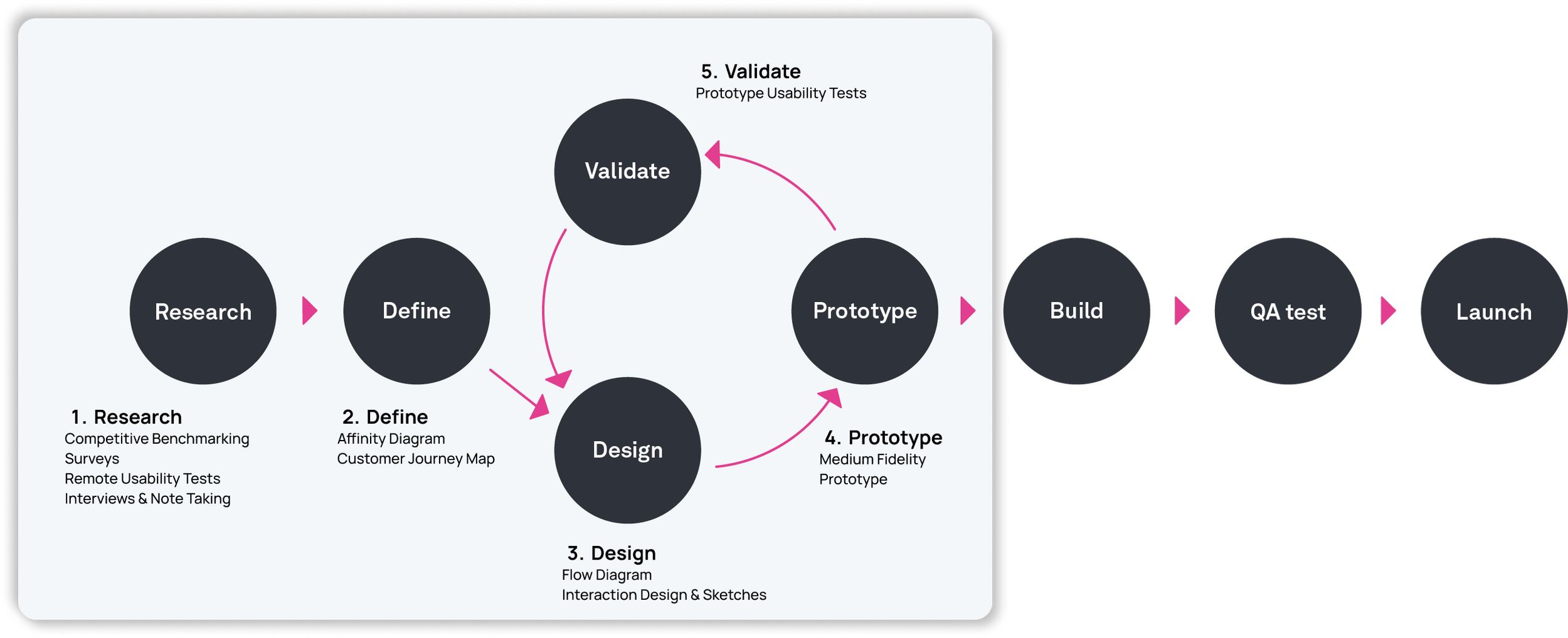


Research

Without pre existing insights I started my research from ground 0 by gathering information on what our competitors do.
I reviewed the usability of the four websites below (3 Airlines and 1 Aggregator), in order to learn how best in class websites approach the booking process:
Ryannar
Easyjet
Aegean Airlines
Scyscanner
Objectives
Learn how best-in-class websites and apps solve the problems we are trying to solve
Understand the established conventions we should follow
Highlight best practice that we should emulate
Highlight worst practice from which we should improve
Aggregators like Skyscanner provide an intuitive experience for finding and comparing the cheapest flights, thanks to their transparent calendar pricing.
Aegean Airlines offers a visually appealing and engaging booking process that enhances the user experience
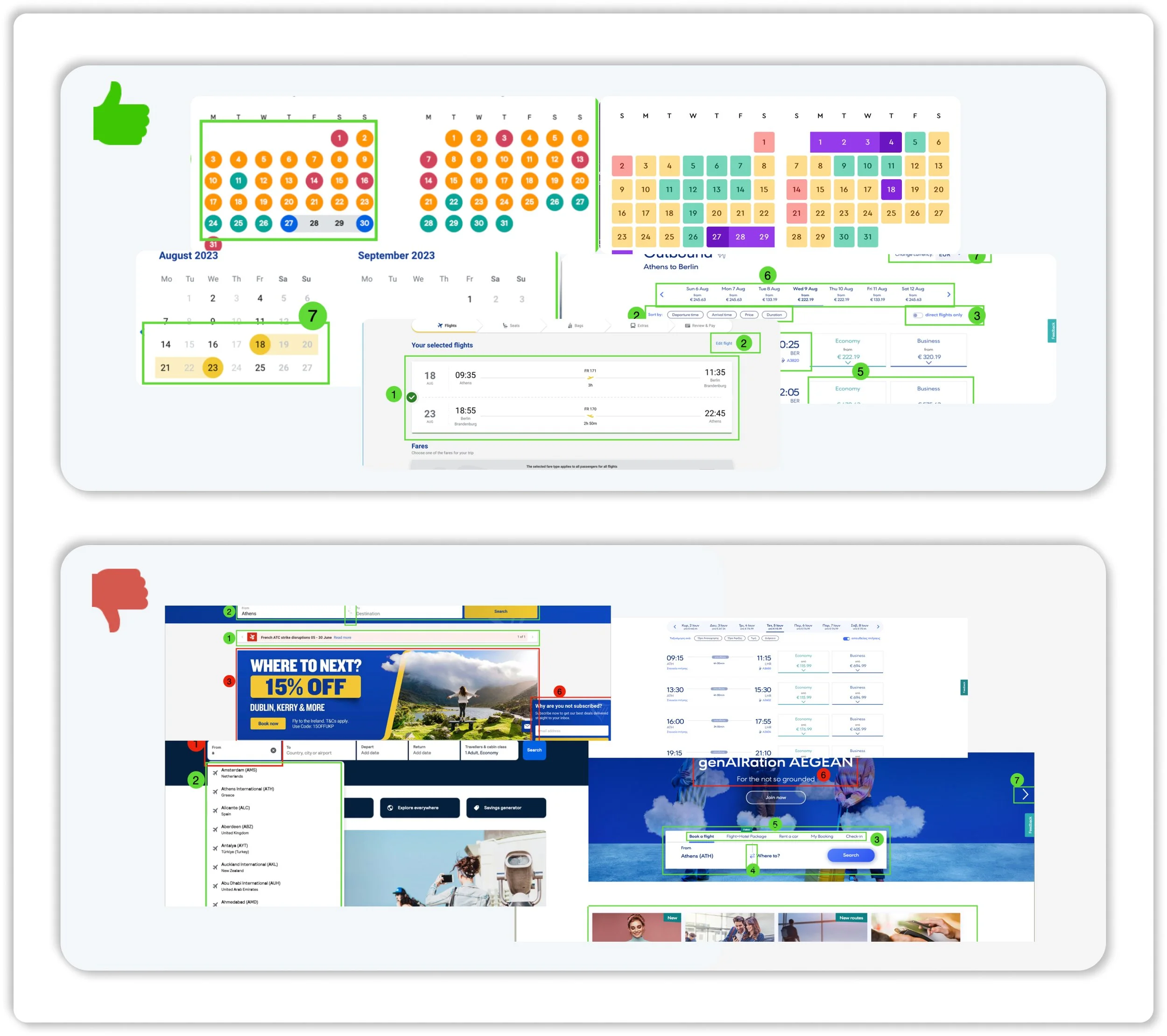
Main takeaways

Ryanair has many cluttered sections and bad ux writing
Aegean offers a difficult and annoying extras additions and luggage
Most of the airlines lack of clear summary details
Tools: Keynote
Competitive Benchmarking
Research
What do the numbers say?
The next step of my research was to realise an online Survey in order to learn more about the goals of people that use Airline Websites.
Why surveys?
Easiest and cheapest way to gather user requirements
Gives a unambiguous direction where to focus on
Powerful - a large number of responses, more ammunition in influencing stakeholders
All the above gave an overall idea of three important aspects I should pay attention such as Pricing, Baggage Policy, Flight Comparison Tools and led me to the conclusion that we should focus the next steps of our research having in mind these 3 core themes.
4
Minute Survey
I included open unstructured and closed structured questions to get a mix of qualitative and quantitative data and I kept the survey to just 11 questions in order to get the maximum response. Most of the respondents were recruited by my personal contacts and social media platforms such as: Dissertation Exchange Facebook Group.
11
Questions

48
Respodents
Tools: Google Forms

Main takeaways
“It’s all about price and ease.”
Surveys
Research
At this stage I got involved as a note taker for 4 Usability tests already done by the UX Institute prior to
my research in order to practice the note taking skills.
Airlines tested here were Aer Lingus and Eurowings by 2 different participants
After this, I moderated and conducted 5 Remote Usability tests on various airlines with interviews -one of which was a comparative one- with 5 different participants.
I chose a wide range of airlines both some with good reputation and others with quite negative in order to gain wider and richer insights.
Objectives
My goal was to get rich insights on the challenges users face during the booking process.
Learn about their context of use, their goals and behaviours:
What are they trying to do
Who they are
Who are they with
Where are they
Learn about the goals and behaviours of customers when booking flights
Which are their pain points

Main takeaways
Lufthansa Airlines
Emirates
Eurowings
Aer Lingus
This phase was the game changer! At a first glance the findings where many and chaotic. The usability tests revealed the many pain-points that could be improved and also highlighted positive aspects of the process that could be incorporated when designing the solution.
Tools: Zoom, Teams
Remote Usability tests & Interviews
8
Airlines Tested
Ryanair
EasyJet
Aegean Airlines
Wizz Air
11
Interviews
8
Participants
2. Define
Affinity Diagram
Customer Journey Map
2. Define
Affinity Diagram
57 Groups of Insights
206 Post Its
16 Themes
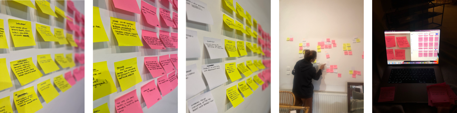
After completing my research, I had gathered a ton of insights that I had to somehow analyse, cluster and filter this is why I did an Affinity Diagram in collaboration with another UX Designer
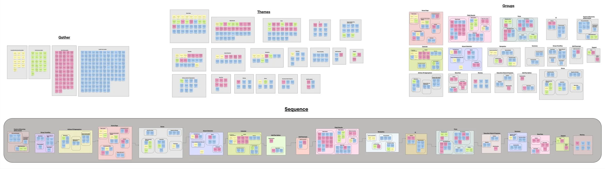
Tools: Miro /Post its
From chaos to order
2. Define
Tools: Miro
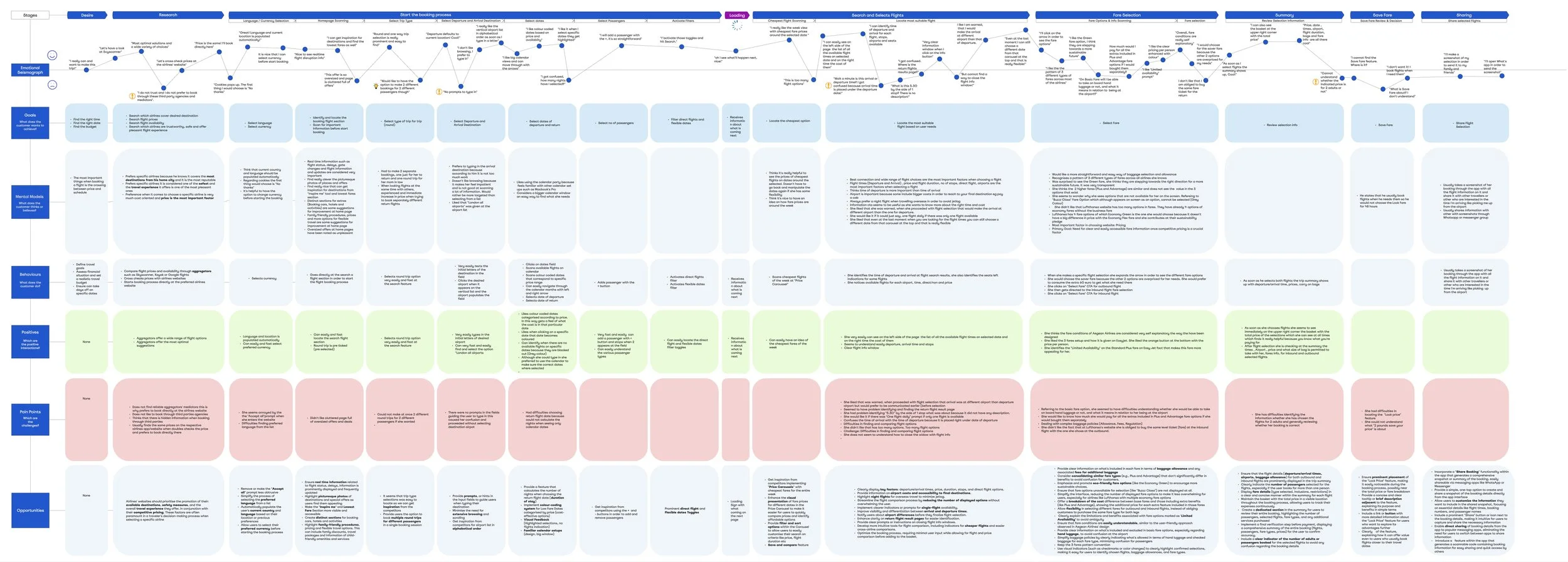
Customer Journey map
To consolidate everything and gain a holistic view of the customer experience for a specific use case—uncovering moments of both frustration and delight, but most importantly, identifying opportunities for improvement—I created a highly analytical customer journey map. The journey resembled a cardiogram, with a series of small, detailed steps reflecting users goals, mental models, behaviours, positive experience and pain points, while also highlighting key areas for improvement.
2. Define

Discoveries - The big picture
Users ultimate goal:
What users do when want to book flight tickets?
How can I and my co- travellers find and book the cheapest round trip possible for my desired destination on a range of specific dates in a friction free way?
The booking process already seemed to be at a good level in terms of usability. Users have a well-established mental model when it comes to booking airline tickets, with existing conventions being deeply integrated into their behavior. The behavioral pattern of many online users typically follows this pattern:
They browse aggregator websites on a laptop to find the best deals, then go directly to the airlines to make their purchase. There are several reasons for this behavior:
Suspicion and lack of trust in intermediaries (hidden costs, difficulties in handling disruptions, and poor communication)
Membership programs that incentivize direct purchases
Aggregators provide useful comparison tools (such as calendars with pricing) and offer diverse, optimized suggestions
These insights led me to conclude that the booking process I design must fit within the established conventions—it should not be too innovative, but only make small interventions where necessary, while incorporating the comparison tools that aggregators offer.
2. Define
Discoveries - The problems
Uncovering Usability Gaps: Key Areas for Improvement
The research revealed numerous pain points and usability issues that need to be addressed:
Difficulties in price comparison
Confusing fare selection
Absence of sharing feature
Intrusive Extras & Sign in
User Confusion Over Earning and Redeeming Airline Miles
Confusion with input fields
Discoveries - The good practice
User-Approved Features Enhancing Usability
The research revealed a list of best practice features that users responded positively to and that seemed to enhance usability. These included:
Real-time information
Inspiring, picturesque photos on the homepage
A "Lowest Fare" section
Clear sections for booking cars, hotels, and activities
Membership programs
Green Fare options
Limited availability indicators on fares
A three-fare structure
Step indicators throughout the process
Strong adherence to established conventions
Live chat customer support
2. Define
Prioritization
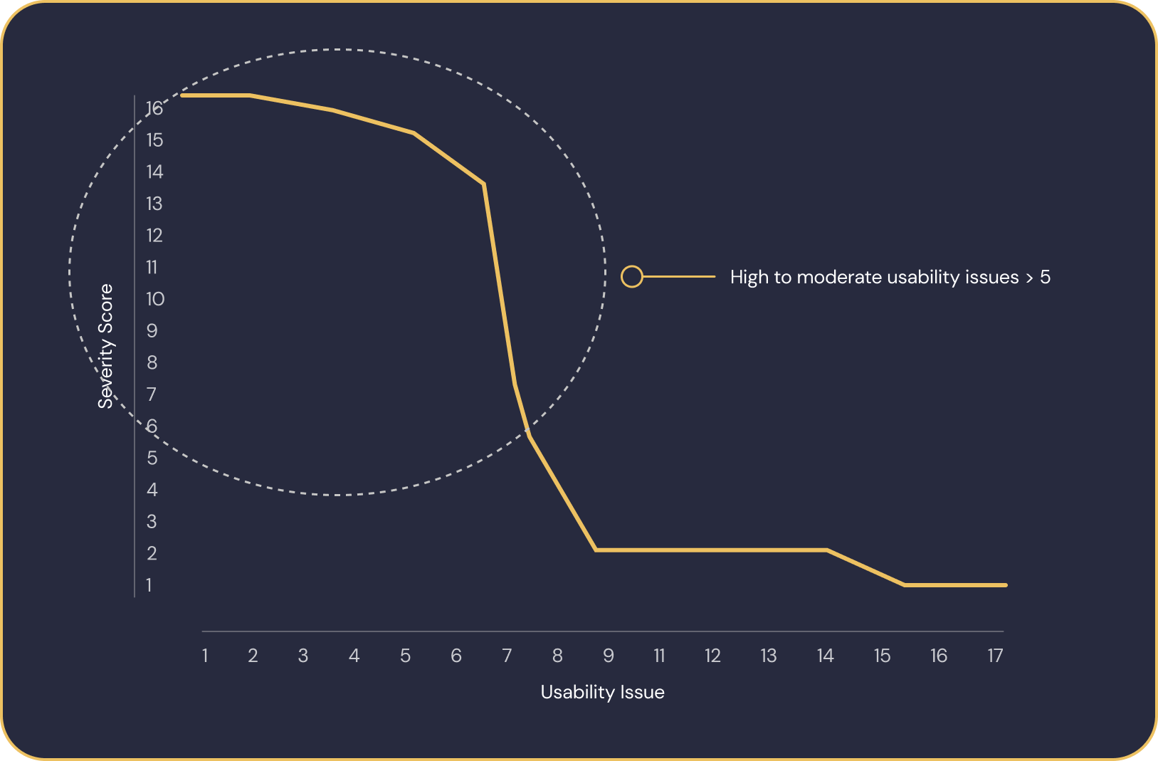
Which Usability Problems Should I Address and Why?
To prioritize which usability problems to address first, I developed an approach to quantify the impact of each issue. This allows me to focus on high-impact problems that will provide the most value when resolved.
To do this, I created an impact score. The impact score is calculated by multiplying the Nielsen/Norman severity rating of each usability error (on a scale from 1 to 4) by the frequency of occurrence of the error. This helps ensure that problems which are both severe and frequent are prioritized for fixing.
Only issues that scored high to moderate impact* were considered.

2. Define
Although the airline booking process is generally well-developed with widely adopted conventions, users still struggle to find the cheapest flights, compare costs, and communicate their searches seamlessly.
Reframing the problem
This led to the question:
“How might we help a users find the cheapest flights, compare costs and communicate their searches seamlessly?”
2. Define


Design Goals
Given the user research I outlined the goals for my design as follows:
Enhance Cheapest Flight Scanning and Selection:
Focus on optimizing the flight search process, particularly through the calendar view and flight results display, to help users quickly find and select the cheapest flights. The goal is to improve the visibility of fare options and make it easier for users to compare and choose the best flight based on price and schedule.
Maximize Price Transparency:
Introduce a Share Results Feature:
Avoid Intrusive Extras and Sign-ins:
Streamline Form Completion:
Ensure price transparency throughout the user journey by clearly displaying all fare details and associated extras. This will be achieved by improving the design of summaries and allowing for more flexible fare selections. Users should always know the total cost, including extras like baggage, seat selection, and other add-ons, to make informed decisions.
Implement a feature that allows users to easily share flight search results with others. This will facilitate collaborative decision-making for users booking flights together or seeking input from friends or family members.
Minimize disruptions by reducing intrusive prompts for extras and unnecessary sign-in requirements. Extras should be offered in a way that feels optional and non-intrusive, allowing users to focus on their primary task—finding the right flight—without feeling pressured to create an account or add unnecessary services.
Simplify the completion of fields and forms throughout the flight booking process. This includes reducing the number of steps required to input personal and payment information, ensuring form fields are intuitive, and leveraging design patterns that minimize user effort while maintaining accuracy.
3. Design
Flow diagram
Interaction design & sketches
3. Design
Perfecting the User Flow
I started by designing the high level flow (flight search through to payment) of the flight booking process in a hand sketched Flow Diagram addressing all the problems defined in the Customer Journey Map
Flow Diagram for Desktop: Round trip to European destination; fixed dates; Economy class; 2 passengers; no bags; no extras; no login
I carefully outlined the entire flow, detailing screens, states, and interactions, before transitioning the sketches to a digital format. This in-depth process gave me a clear understanding of the effort needed to craft a frictionless booking experience—it’s far from effortless! As I began refining my hand-drawn sketches, the initial user flow naturally evolved
Tools: Pen&Paper/Figjam
3. Design
Pen & Paper Ideation
Right before I started sketching, I conducted a second round of competitive benchmarking, exploring websites known for their excellent UX, such as Delta and JetBlue Airlines, to gain further inspiration.
To work efficiently and primarily demonstrate functionality, features, content, and user flows, I created hand-sketched low-fidelity wireframes. This approach allowed me to sketch out and explore various options for addressing the pain points, discuss potential solutions with the team, and make initial basic decisions before moving on to the design of the medium-fidelity wireframes.

Interaction Design Sketches of home page; calendar with colour coded prices; input fields; flight selection with interactive bar chart; fare selection; sharing feature; live chat feature
By sketching out the screens I could decide on such things as Layout, the best place for CTA buttons that made sense in terms of moving the mouse and eye movement. It helped me to determine hierarchies of text and content in busy areas.
Tools: Pen & Paper
4. Prototype
4. Prototype
Designing the solution
With much of the flight booking solution already designed, I was able to create the first version of the medium-fidelity prototype. While working on the prototype, I identified changes that needed to be implemented to improve the user experience based on the earlier sketches. The wireframes began to take shape, and the ideas either started to come together or revealed where adjustments were needed.

Tools: Figma
5. Validate
Remote Usability tests & Interviews on interactive prototype
5
Participants
1
hour session
4
Tasks
5. Validate
Usability tests on interactive prototyping
I conducted a remote usability test with 5 participants, aged 25-40. The goal was to evaluate the entire user journey through the booking process, with a focus on the design changes I had implemented. I wanted to test whether my design goals were met at first glance. The users had 4 main tasks:
Tasks Tested

Tools: Zoom, Teams, Dovetail
Final Design
22
Changes from Usability test
2
Prototype Iterations
32
Prototype Screens
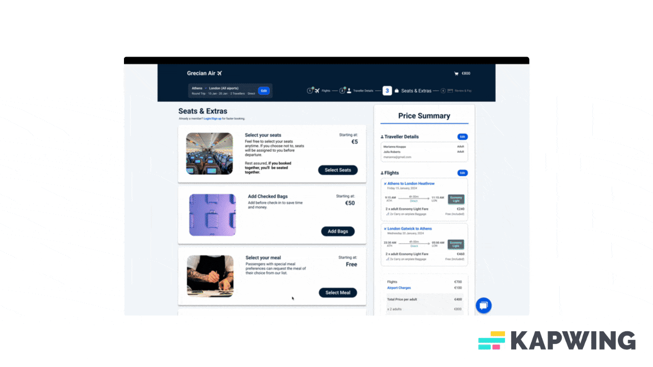
High Fidelity Prototype
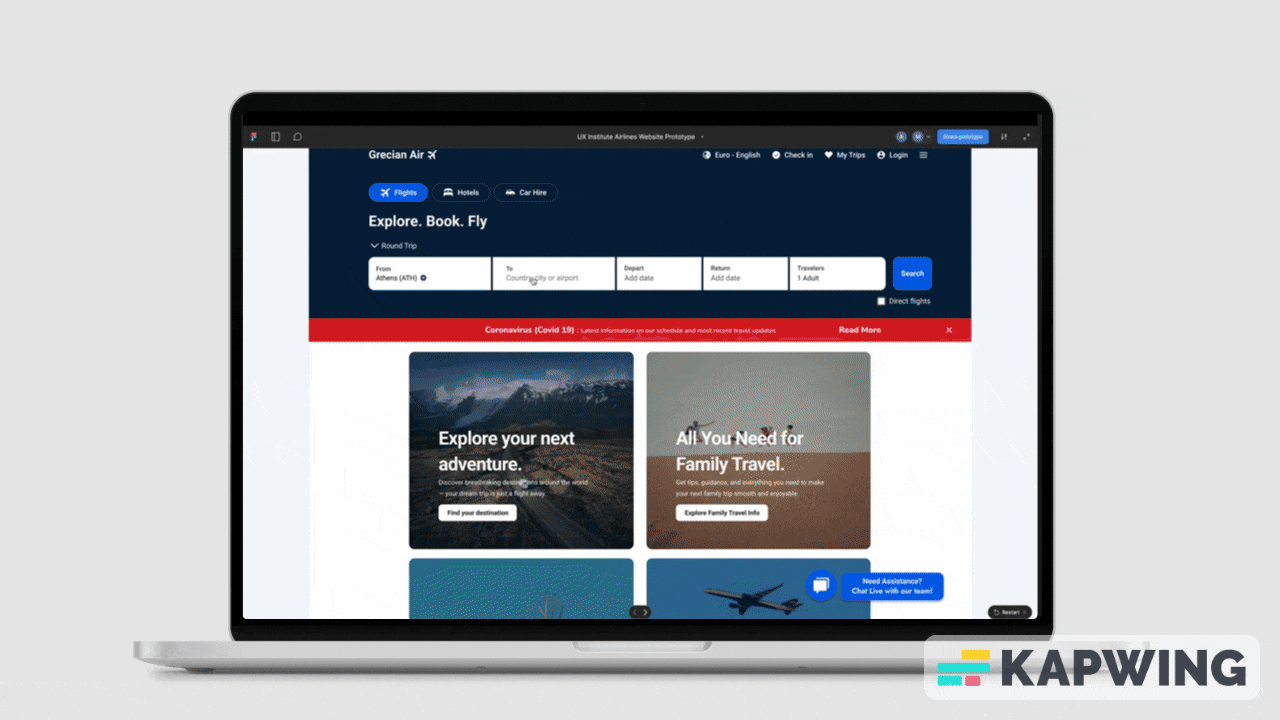
Final Design

Give it a go!
Design Highlights

Design System

Final Design
Annotations

Final Design
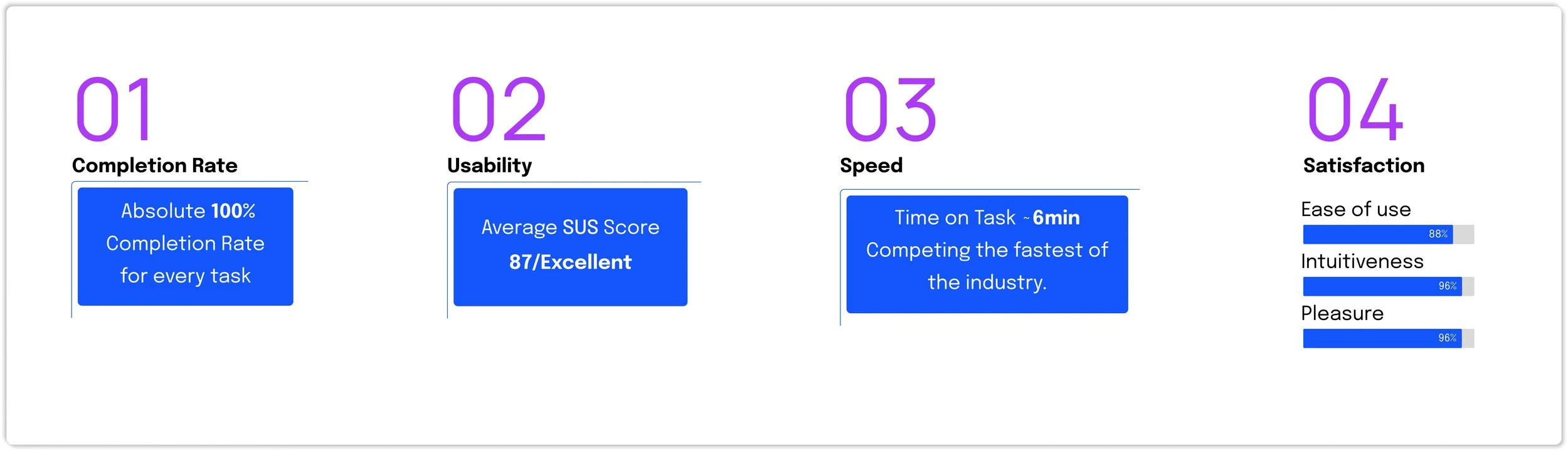
The impact
The impact
Positive results and the next steps

Lessons learned
In this project I had the chance to learn and practice user experience design, someone would say it is my passport towards this field.
For me it was very educative as :
I dealt with a very big project with large amount of content
I learned and practice every step of the design process from Research to Final UI Design and handover to developers
I wrote many deliverables
I had the chance to learn and practice new digital tools such as Figma, Miro, Dovetail and Squarespace
I realised how collaborative and conversational UX is and how different inputs and opinions contribute to your goals.
Although at the first glance it seems a common sense process , I realised that it can end up being really chaotic and how important setting specific goals and context are.
Realised that user research and especially usability tests (which I really enjoyed) are the quintessence of User Experience Design
Challenges
My biggest challenge was developing my skills in UI and visual design, both for my prototype and presentations. This is an ongoing process, which did extend my timeline. It’s easy to get caught up in perfecting aesthetic details.
Without being part of a team and as the sole UX designer, I had to make all project decisions independently. At times, this led to uncertainty about whether I was heading in the right direction.
Setting up my portfolio was the final step of this journey, but it was lengthy since much content had to be created from scratch. In hindsight, I would have prepared more of this material while working on various UX tasks and deliverables.
Thanks for scrolling!
If you have any feedback, want to collaborate or just want to say hello, let’s get in touch!
mariannakouppa@gmail.com